Dark moody interior design has moved from a niche aesthetic into the mainstream, and for good reason. Rather than feeling like a dungeon, when executed properly, dark moody spaces feel intimate, sophisticated, and genuinely inviting. The key lies in understanding how to balance deep colors, strategic lighting, and texture to create rooms that feel both dramatic and comfortable. Whether someone’s drawn to a moody home office, a cozy bedroom, or an entire dark aesthetic throughout their living space, this design approach offers something different from the endless parade of bright, minimalist interiors. With the right techniques and material choices, homeowners can achieve that coveted high-end look without professional design fees.
Key Takeaways
- Dark moody interior design relies on strategic lighting, deep color palettes, and texture layering to create sophisticated, inviting spaces rather than gloomy rooms.
- Jewel tones like emerald green and sapphire blue, combined with neutral dark colors such as charcoal and warm taupe, form the foundation of a cohesive dark moody aesthetic.
- Proper lighting in dark moody spaces requires multiple layers—ambient, task, and accent—with warm color temperatures (2700K–3000K) that work better with deep colors than cool light.
- Texture and material contrast prevent visual flatness in dark moody interiors; combine velvet, linen, wood, and metallic finishes to create depth and reflect light.
- High-contrast elements like white trim, light-colored rugs, artwork, and metallic accents are essential to preventing dark moody rooms from feeling oppressive or cave-like.
- Quality paint preparation, premium interior paint, and dimmable fixtures are worthwhile investments that ensure dark moody design looks intentional and lasts longer.
What Defines Dark Moody Interior Design
Color Palettes and Wall Treatments
Deep Jewel Tones and Rich Neutrals
The foundation of dark moody design starts with color selection. Jewel tones, emerald green, sapphire blue, deep amethyst, and rich teal, create visual richness without overwhelming a space. These colors perform particularly well on feature walls because they anchor the room’s aesthetic while leaving other walls neutral. A homeowner might paint three walls in warm white or soft gray while reserving one wall for the deep jewel tone: this approach adds drama without committing the entire room to darkness.
Neutral dark colors like charcoal, warm taupe, and deep gray work as foundation colors because they pair seamlessly with both jewel tones and accent pieces. When selecting paint, look for colors with slight undertones rather than pure neutrals, a gray with warm brown undertones feels more sophisticated than flat gray-gray. Test paint samples on walls at different times of day: dark colors shift dramatically under natural light versus artificial light.
For wall treatment beyond paint, wallpaper with subtle texture or pattern adds dimension. A damask or botanical print in dark charcoal on matte finish feels refined, while solid textured finishes (matte or eggshell) hide imperfections better than glossy finishes. Dark paint requires meticulous surface prep: fill all nail holes, sand smooth any imperfections, and prime any patched areas with tinted primer before painting. Dark colors reveal every application mistake, so two coats of quality paint are essential. Budget approximately $50–75 per gallon for mid-to-premium interior paint: dark moody spaces demand durability and color depth that budget paint can’t deliver.
Lighting Strategies for Moody Spaces
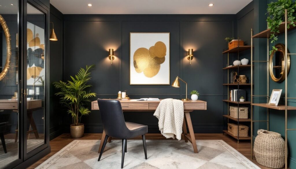
Lighting is the linchpin of dark moody design. Poor lighting makes moody spaces feel gloomy and claustrophobic: strategic lighting transforms them into havens. The approach requires multiple light layers: ambient (ceiling fixtures providing overall illumination), task (focused light for reading or work), and accent (highlighting architectural features or art). Ambient lighting should never rely on a single overhead fixture. Instead, combine recessed lights with wall sconces and a statement pendant or chandelier. Recessed lights spaced 16–24 inches from the wall prevent harsh shadows and create even illumination without dominating the visual field. Warm color temperatures, 2700K or 3000K, pair better with dark colors than cool 4000K light, which can make deep colors look cold and uninviting. Wall sconces flanking a bed or mirror add both light and visual interest. Accent lighting via track lights, picture lights, or LED strips behind floating shelves draws attention to artwork or architectural details, breaking up wall-to-wall darkness. Many homeowners underestimate how much light dark rooms actually need: a room painted deep charcoal requires roughly 20% more total lumens than a white room to feel equally bright. The investment in quality fixtures, dimmable options especially, pays dividends because moody design thrives on the ability to shift ambiance from energizing (brighter) to intimate (dimmed).
Furniture and Textures That Enhance Darkness
Furniture selection in a dark moody space should prioritize texture and material contrast. Solid dark furniture against dark walls creates visual flatness: layering different textures prevents this. Pairing a charcoal sofa with a chunky knit throw, a leather ottoman, and a velvet accent pillow creates depth and keeps the eye moving. Wood furniture, especially pieces with warm or medium tones, provides natural contrast against dark walls without clashing. Mid-tone walnut or reclaimed wood pieces feel particularly at home in moody design. Upholstered furniture in rich fabrics like velvet, linen, and wool adds tactile interest: glossy or metallic finishes on hardware and legs catch light and prevent the entire space from disappearing into darkness. Rugs are critical in dark rooms. A light-colored or patterned rug grounds the space and prevents dark walls and furniture from creating an overwhelming cave-like feeling. Layering rugs (a large neutral base with a smaller patterned rug on top) adds sophistication. Material choices should vary: pair matte wall paint with glossy tile baseboards, metallic lamp bases, or lacquered side tables. Glass shelving, mirrored accents, and metal frames all reflect light and prevent visual monotony. Avoid rooms that are uniformly matte or uniformly dark: the interplay of finish and light reflection is what separates intentional moody design from simple darkness.
Incorporating Contrast and Visual Interest
High-contrast design elements are the secret weapon in moody spaces. White trim, light-colored baseboards, or pale wood shelving against dark walls creates visual breathing room. Some homeowners worry this feels too “colonial,” but modern moody design embraces this contrast: it’s what prevents dark rooms from feeling oppressive. Artwork becomes especially important in dark spaces because it functions as both decoration and light reflection. A painting with light values or gold leaf detailing naturally draws the eye and prevents walls from appearing flat. Consider oversized pieces rather than gallery-wall clusters: one powerful art piece has more impact than a fussy arrangement. Architectural elements like crown molding or wainscoting, even in matching dark colors, add visual texture and definition. Metallic accents in brass, gold, or copper hardware, mirror frames, and light fixtures warm up dark rooms while adding glamour. These shouldn’t feel scattered: choose a primary metal (brass or copper work best with warm dark tones, while nickel pairs with cooler grays) and repeat it throughout. Books on shelves provide natural color variation and personality, as do plants and natural materials like woven baskets or ceramic pieces. The goal is to create visual rhythm that keeps the eye engaged rather than allowing dark walls to dominate the entire field of vision.
Conclusion
Dark moody interior design isn’t about creating a dark cave, it’s about using deep colors, strategic lighting, texture, and contrast to build spaces that feel intentional, sophisticated, and genuinely appealing. The approach requires more planning than painting walls a neutral shade, but the payoff is a home that reflects personality and stands apart from cookie-cutter interiors. Success hinges on balancing darkness with light, adding textural variety, and never skipping proper surface prep and quality materials. When executed thoughtfully, dark moody spaces become the rooms people genuinely want to spend time in.