
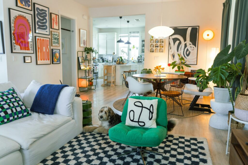
Neutral rooms will always have their place, but the homes people actually remember are the ones unafraid of color. A lacquered emerald study, a powder room wrapped in magenta grasscloth, a velvet sofa in a blue so deep it looks almost black: these are the moments that give a space its personality.
The trouble is that bold color is easy to get wrong. Used carelessly, a saturated hue can make a room feel smaller or simply louder than anyone intended. Used well, it does the opposite. It organizes a room, draws the eye where you want it, and makes everything around it feel considered.
Start With the Feeling, Not the Swatch
Before you fall in love with a shade, decide how you want the room to feel. A dining room built for long, candlelit dinners wants depth, so think oxblood, forest green, or a moody navy. A breakfast nook wants energy, which points you toward a clear yellow or a grassy green. When you lead with the mood, the color becomes a tool rather than a gamble.
This is one of the first questions the best luxury interior design teams will ask you: not “what is your favorite color?” but “how do you want to feel when you walk in?” That single question quietly rules out dozens of pretty shades that would fight the room, and it turns a vague wish into a specific, workable direction.
Use the 60-30-10 Rule as a Safety Net
The classic decorator ratio still holds up. Roughly 60 percent of a room should be your dominant tone, usually the walls and largest upholstery, 30 percent a supporting color in rugs and drapery, and 10 percent your true accent, the daring one. Because that final slice is small, it is exactly where you can afford to be fearless.
A single magenta ottoman in an otherwise restrained room reads as chic and deliberate. Magenta walls, a magenta sofa, and magenta drapery all at once read as a decision no one edited. Keeping your boldest color contained is what lets it feel like a choice rather than an accident.
Anchor Bold Color With Something Quiet
Saturated color needs a partner that lets it breathe. Pair a jewel-toned wall with warm woods, aged brass, natural stone, or plenty of crisp white trim, and the eye suddenly has a place to rest. Those quieter materials act like punctuation, giving the color room to register as a feature instead of an assault.
This is also why so many bold rooms lean on a leopard or animal-print accent. A well-chosen pattern behaves almost like a neutral, tying several strong colors together rather than competing with them. The result feels layered and confident, not chaotic.
Test Every Shade in Your Own Light
Every color changes across the day, and no swatch in a store can tell you how yours will behave at home. Paint a generous sample, at least two feet square, on more than one wall, then live with it through morning light, lamplight, and a gray afternoon before you commit.
Light matters more than most people expect, and this is where professional interior design services prove their worth. A bright, sun-flooded room reads very differently from a shaded, north-facing one, so a shade that looks sophisticated in a showroom can turn unexpectedly minty or chalky in the room it is actually meant for.
Know When to Bring in a Professional
Plenty of homeowners can handle a single accent wall on a Saturday afternoon, and that kind of low-stakes experiment is worth encouraging. The calculation changes once color becomes a whole-home story that has to flow from room to room, or once you are pairing bold choices with real investment pieces.
That is where high-end interior design earns its keep. A designer’s trained eye and their access to trade-only materials turn “I think I like green” into a specific palette that works in your light, with your furniture, for the way you actually live, without the expensive trial and error.
The Takeaway
Bold color is not about being loud. Done thoughtfully, it is one of the most personal and sophisticated tools you have, capable of making a room feel entirely your own.
Start with the feeling, keep your ratios honest, anchor the drama with something quiet, and test everything in your own light. Do that, and you end up with a home that looks like someone interesting lives there, because someone does.